Form customisation
Aidbox Forms gives you ability to customize form looking. To do this you can create a new theme, and specify it in sdc-service.
The simplest variant of forms theme looks like this:
simplest-sdc-theme
{:zen/tags #{aidbox.sdc/theme}
 :zen/desc "Default SDC theme"
 :main-color [120 38 245]}
Each color in theme represented as vector with three RGB channels: \[RED GREEN BLUE]
To use this theme specify simplest-sdc-theme under the :theme key in SDC service.
In this theme we change only main-color, but this color changes a lot in Aidbox Forms looking: inputs border color, buttons background color, etc. So you can use just one key to style forms with your brand color.
If you need more detailed styling, you can use extended theme definition. With this you can change separately buttons main color, text color, input border, background, text colors, background colors, font and add a brand image.
Buttons
To change buttons appearance add to theme scheme a new map under :button key:
buttons-sdc-theme
{:zen/tags #{aidbox.sdc/theme}
 :zen/desc "Default SDC theme"
 :main-color [120 38 245]
 :button {:text-color [0 94 184]
          :accent-color [255 255 255]}}
For filled buttons accent color will be used as background color, for outlined buttons as border color and text color.
Also you can change text of Save & Close and Submit buttons.
Read more about Form API (deprecated)
buttons-sdc-theme
{:zen/tags #{aidbox.sdc/theme}
 :zen/desc "Default SDC theme"
 :main-color [120 38 245]
 :button {:redirect-text "Close"
          :submit-text "Sign"
	      :text-color [0 94 184]
          :accent-color [255 255 255]}}
Inputs
To change inputs appearance add to theme scheme a new map under :input key:
inputs-sdc-theme
{:zen/tags #{aidbox.sdc/theme}
 :zen/desc "Theme styled with NHS colors"
 :main-color [0 94 184]
 :input {:accent-color [0 94 184]
         :text-color [35 31 32]
         :background-color [232 237 238]}}
Here accent color will be used as border color on hover, focused state.
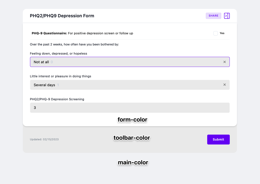
Background colors
Also you can change background colors:
background-sdc-theme
{:zen/tags #{aidbox.sdc/theme}
 :zen/desc "Theme styled with NHS colors"
 :main-color [0 94 184]
 :background {:main-color [232 237 238]
              :form-color [255 255 255]
              :toolbar-color [118 134 146]}}
To understand what each color is look at the image below:
Font
To change font specify the :font-family in theme scheme. Currently we support fonts only from this list, but we continue to add support for other fonts:
- Inter
- Product Sans
- Gotham Pro
font-sdc-theme
{:zen/tags #{aidbox.sdc/theme}
 :zen/desc "Theme styled with NHS colors"
 :main-color [0 94 184]
 :font-family "Product Sans"}
Brand images
You can add brand image or logo of your company by adding a new map under the key :brand-image and specify the location and the URL to image:
brand-image-theme
{:zen/tags #{aidbox.sdc/theme}
 :zen/desc "Theme styled with NHS colors"
 :main-color [0 94 184]
 :brand-image {:top-right {:url "..."}
               :bottom-left {:url "...}}}
Your images will be placed as following:

So full theme could look like this:
nhs-sdc-theme
{:zen/tags #{aidbox.sdc/theme}
 :zen/desc "Theme styled with NHS colors"
 :main-color [0 94 184]
 :font-family "Gotham Pro"
 :brand-image {:top-right {:url "...."}
               :bottom-left {:url "...."}}
 :background {:main-color [232 237 238]
              :form-color [255 255 255]
              :toolbar-color [118 134 146]}
 :input {:accent-color [0 94 184]
         :text-color [35 31 32]
         :background-color [232 237 238]}
 :button {:accent-color [0 94 184]
          :text-color [255 255 255]}}
How to change font size
To change font size, we have two settings in theme:
:basefontsize:input {:fontsize}
First settings will modify field labels, sections titles, etc. The second will modify font size in inputs.

font-theme
{:zen/tags #{aidbox.sdc/theme}
 :zen/desc "Theme with font sizes modified"
 :base-font-size "16px"
 :input {:font-size "18px"}}
How to display one form with different themes
Theme that you specify in sdc-service is default theme. You can specify theme for each form individually.
In the link that you share with users just set query parameter theme with the symbol of form:
aidbox-instance.io/ui/sdc#/documents/33fbdccb-0398-46ab-bce4-6160259552a8?policy-token=...aidbox-instance.io/ui/sdc?theme=sdc-box/hs-red-theme#/documents/33fbdccb-0398-46ab-bce4-6160259552a8?policy-token=...It's important to put this parameter before fragment part otherwise it will be ignored and default theme will be applied